Wes Anderson: Recreating theatre in cinema
The worlds of Wes Anderson are both puppet-like and frighteningly realistic, which makes his work very interesting to watch and analyze. The director's new film, French Dispatch, is currently in cinemas, so there's no better time to immerse yourself in Wes Andreeson's particular directorial style.


Sometimes you feel like watching a film with a cozy atmosphere. And that's where Wes Anderson's films are ideal, because he's the only director who's been able to recreate a unique theatrical style in cinema. His worlds are both puppet-like and frighteningly realistic, which makes his work very interesting to watch and analyse. Plus, the director's new film, ''French Dispatch'', is currently in cinemas, so there's no better time to immerse yourself in Wes Andreeson's particular directorial style.
But before we continue, we want to remind you that here we promote the love of art and try to inspire you to take your camera and make a short film. Leave the boring pre-production routine to the Filmustage - automatic script breakdown - and focus on your creativity!
Also after a long time of hard work we are happy to announce the beta-testing of the new scheduling feature in the Filmustage software. Be one of the first to test the new functionality - click here for more detailed information.
Art by @nadi_bulochka
Production design
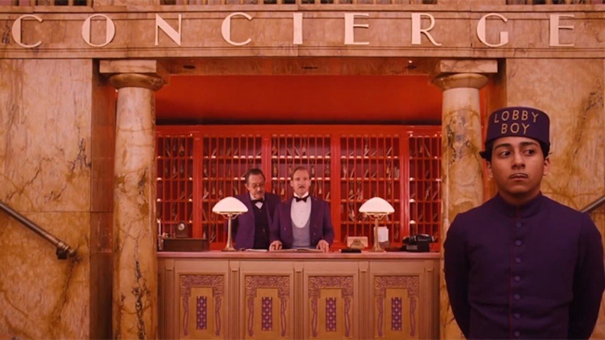
So how do we know we're watching a Wes Anderson film? The answer is simple: the sets and costumes. Anderson had the potential to be a great theatre set designer, because for absolutely every film he recreates worlds and characters. This is the most striking feature of his style, because they are truly man-made and represent a separate art form. The director has worked with four different production designers in different films, but his films maintain the same direction in terms of detail, costumes and sets. All this proves that Wes Anderson himself was behind every artistic decision. However, the consistency of his style does not make his films predictable, as each time Anderson experiments with the setting and locations: each fictional world is unique and for each film he fills the world with new sets and details. For example, a hotel in the fictional land of Zubrowka as in "The Grand Budapest Hotel", or a Boy Scout camp as in "Moonrise Kingdom".
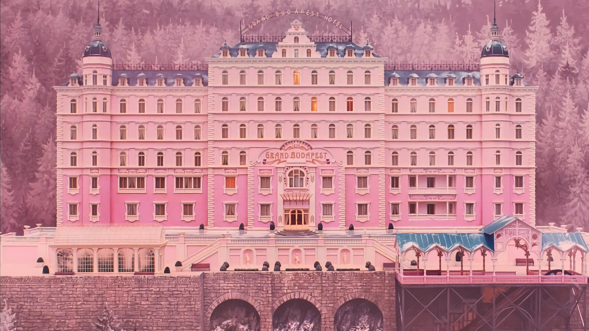
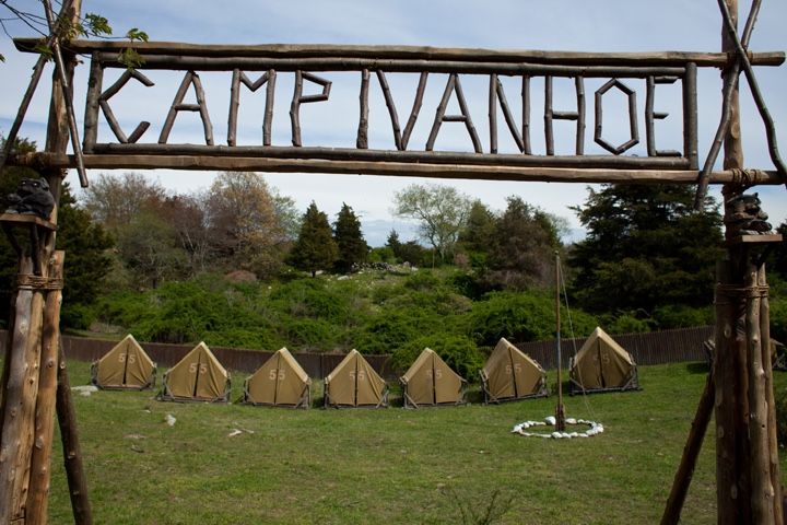
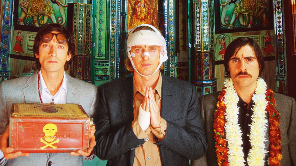
Anderson not only recreates worlds but also transforms them, as in "The Darjeeling Limited": a road movie about a journey through India.
Like no other, Anderson tells a story through the setting. Of course, you don't have to see every object in the frame as a symbol - sometimes it's just simple storytelling through the surroundings that gives us a sense of the nature of the scene. In "The Grand Budapest Hotel", for example, in the opening minutes of the film, when the desolation of the hotel is counterpointed by flashbacks from the past, it lets us know that the hotel's best days are over.
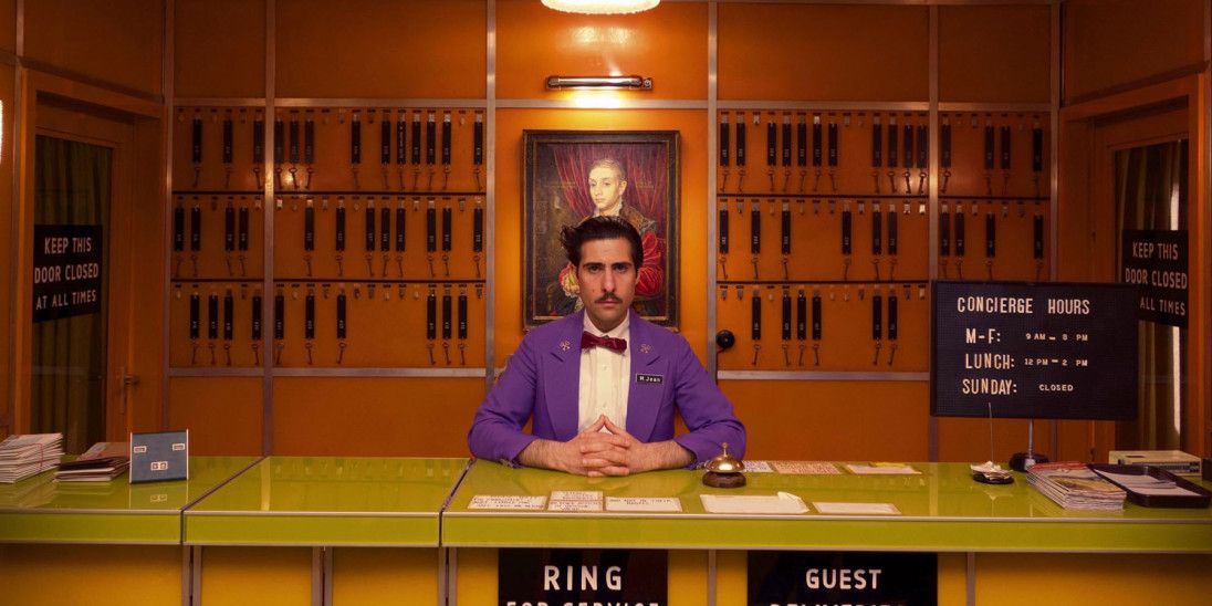
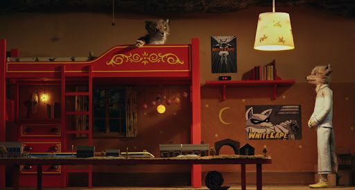
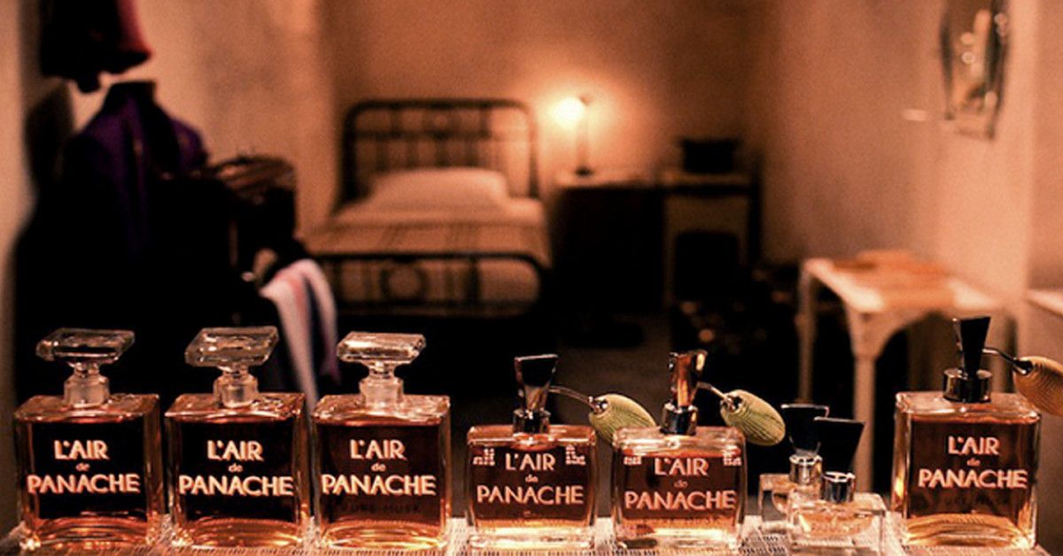
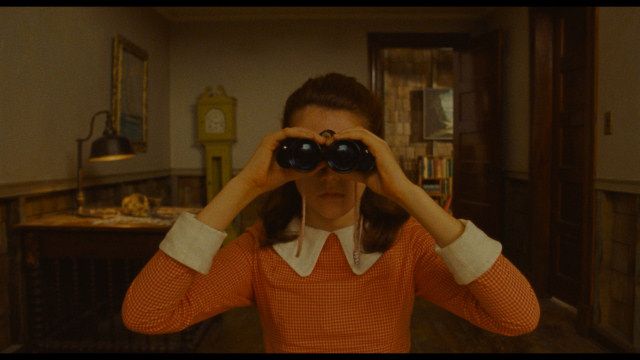
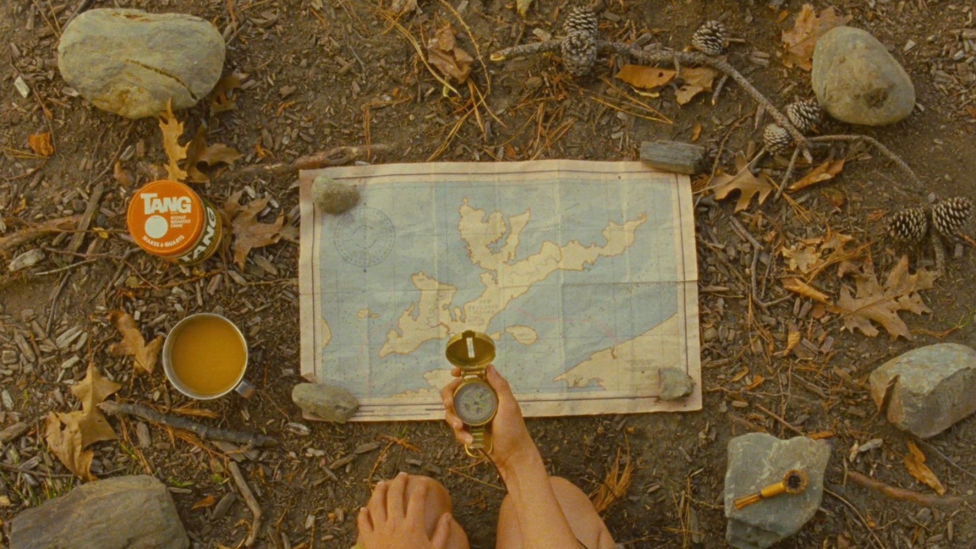
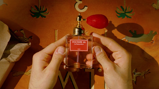
The other side of this feature of Anderson's style is the way he reveals the characters through details, which could take a very long time to list. But among the most striking are the posters of the superhero White Cape in Mr Fox's son's room; Susie's binoculars from "Moonrise Kingdom"; and Misier Gustav's perfume from "The Grand Budapest Hotel".
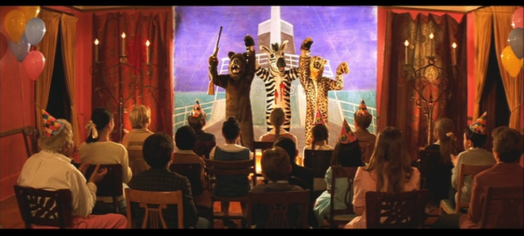
Their costumes say as much about the characters: they are often quirky hats, accessories or bright and epochal outfits. Wes Anderson connects the emotional and mental state of his characters to their clothing. If you watch an Anderson film, you can be sure that the costume is an open book about the character. Like in "The Royal Tenenbaums", for example, in the theatrical performance scene, the costume of the wounded zebra symbolises Margot's inner state. It says more about her than any of the dialogue in the scene.
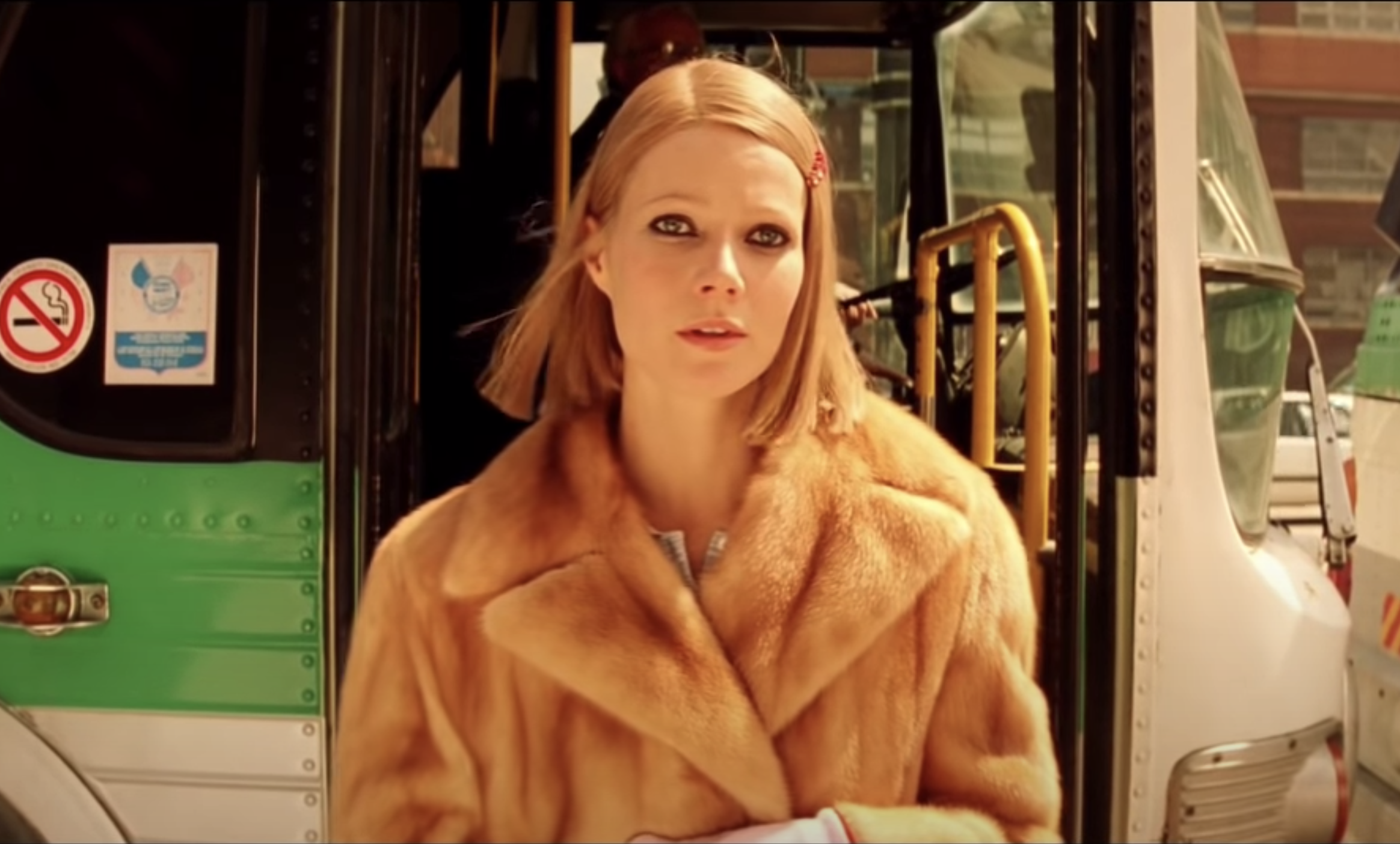
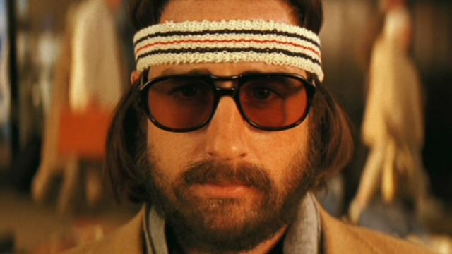
And in "Moonrise Kingdom", ''The Grand Budapest Hotel'' and "The Life Aquatic with Steve Zissou", Anderson doesn't just experiment with imagery, he creates clothes from scratch.
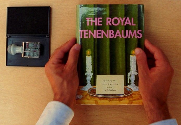
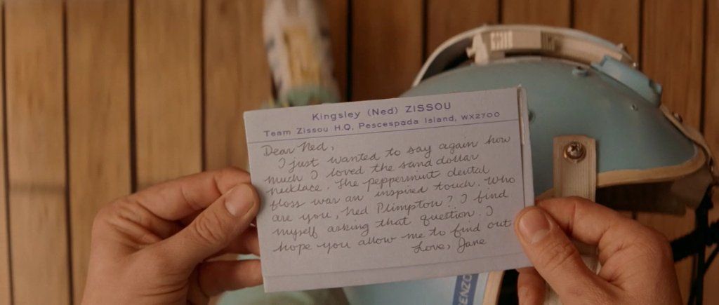
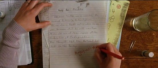
Remember when we said that Wes Anderson's worlds are man-made? Well, this is particularly evident through the polygraphy in Anderson's films: the characters often write or sign something. Anderson pays a lot of attention to this through close-ups, not only to express character through handwriting, but also to emphasise the depth of the world through newspapers, books, paintings. All this gives the world substance and truthfulness.
The visual language of Wes Anderson's films
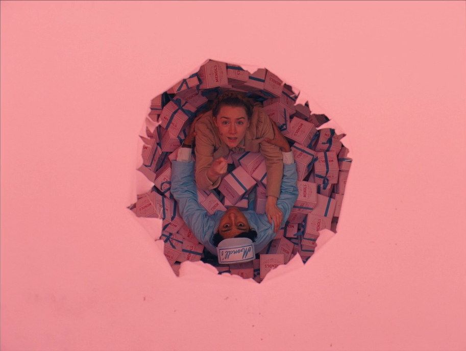
As we have already found out Anderson's films are filled with details and to portray these details Anderson and cameraman Robert Yeoman use the famous topshots and close-ups. The detail in these shots is astounding. They show how important it is for Anderson to bring us, the audience, closer to the characters. This makes Wes Anderson's films very tactile: it's as if the director wanted to convey even the texture of objects, namely plastic, wood, fabric, paper. We think he does it very well!

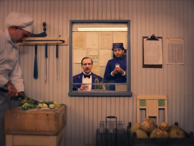
Centring and symmetry are another of the director's trademarks. With the exception of his debut film, "Bottle Rocket", you're unlikely to find non-static shots from Anderson. His style is purely compositional shots that look perfectly precise and aligned. Contrary to the rules, Anderson does not sin to place a character in the centre of the screen, which clearly tells us that the main thing in his films is the people and their relationships. By bringing his shots to a perfect symmetry Anderson creates his theatrical and deliberately artificial world. Using bright and centred aesthetics Anderson, however, speaks to the viewer in an adult language and is not afraid to show violence on the screen. All this makes Anderson's films not so much theatrical, but grotesque and absurd.
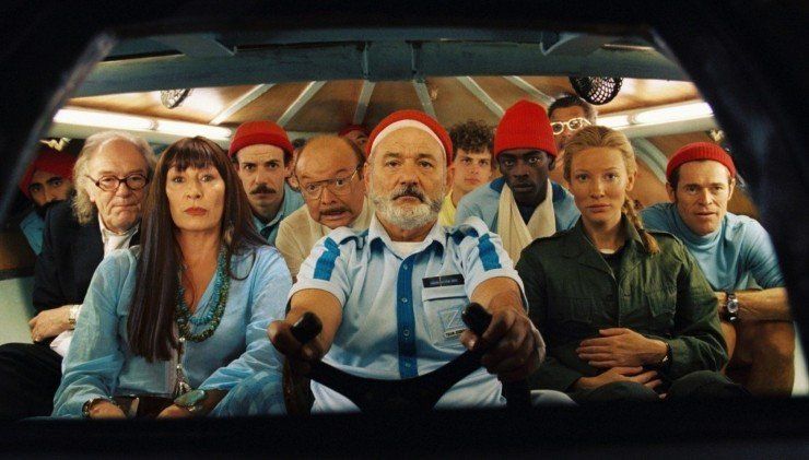
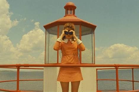
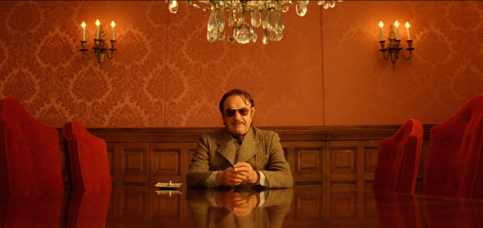
However, one cannot get past the way Anderson creates his own atmosphere of theatricality and puppetry. Predominantly, the director tries to make the space of his film flat: the characters are in the centre of the frame, there are no unusual angles except for the topshots, which also do not convey volume. This is part of Anderson's creative vision: to show the characters as if they were in a giant dollhouse. This can be a metaphor for all his works. Let's break this down with the example of the trail camera: note in the video below, the camera passes the rooms as if overcoming the walls, but it never goes deep enough to show the volume of the room. The aim is to show the characters in their toy-like surroundings.
The director himself, of course, makes no secret of the artificiality of his films, as they are arranged like a theatrical production and divided into acts accordingly.
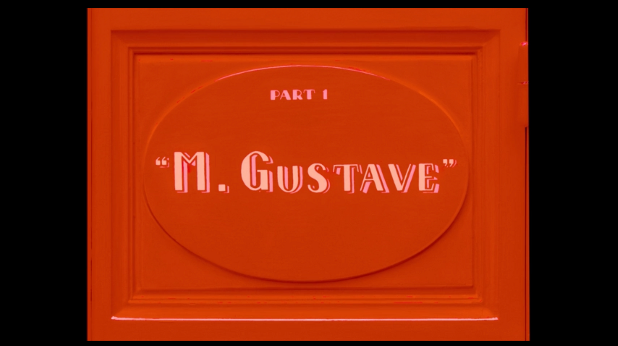
Also, quite often in the director's shots, additional framing appears, creating a frame within the frame itself. This is how Anderson separates the characters or emphasises something.
So what are his films about?
Wes Anderson makes comedies with a vivid atmosphere of melancholia, the source of which lies in family problems. Many of the characters in his films grew up without parents and were lonely in life. That's why the children in his films are precocious, mature adults in search of understanding and love. Whereas adults are the ones who do infantile and irresponsible things. Anderson has literally switched them around, which dramatically affects the experience of watching the films. It is in the characters and the way his films are scripted that he finds the secret of his unique style: the naive and simple things are pompous, while the serious and dramatic moments lack pompousness, which makes them all the more genuine.
Emotional detachment and melancholy are the means by which Anderson helps us to accept the imperfection of being, because after this acceptance we are left with a chance to become better human.
Don't forget to visit Filmustage.com page and try out our AI-based script breakdown service. Looking forward for your professional feedback!
From Breakdown to Budget in Clicks
Save time, cut costs, and let Filmustage’s AI handle the heavy lifting — all in a single day.