Creating fantastic stories and more: Peter Jackson
Let's dive into the amazing worlds created by Peter Jackson and try to recognize his directorial handwriting.
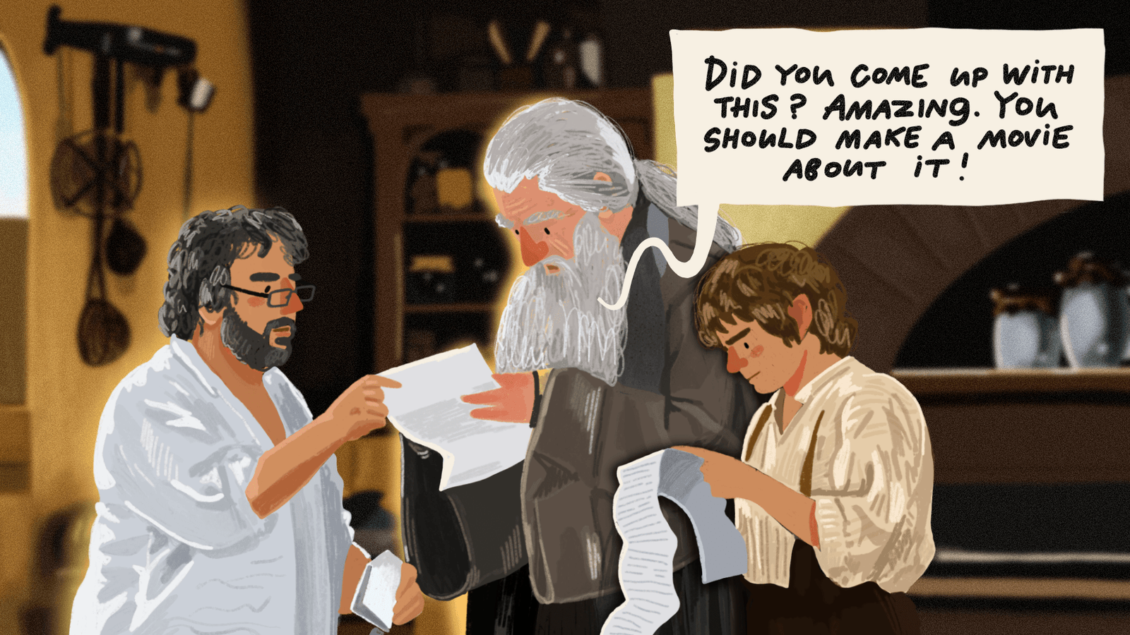
Art by @nadi_bulochka
The finale of "The Lord of the Rings" trilogy was released 20 years ago, but it is still one of the most beloved films worldwide. Thanks to Peter Jackson's directorial style, we never tire of revisiting these films repeatedly. It is amazing how bizarre and unusual the fate of Peter Jackson was. Ever since he was a kid, he has loved the cinematography, and he's tried his hand at a lot of genres, including B-movies. But the multi-million dollar projects with star actors brought him worldwide fame. To the rebel from New Zealand, our new material is dedicated!
From thrash horror to "The Lord of the Rings."
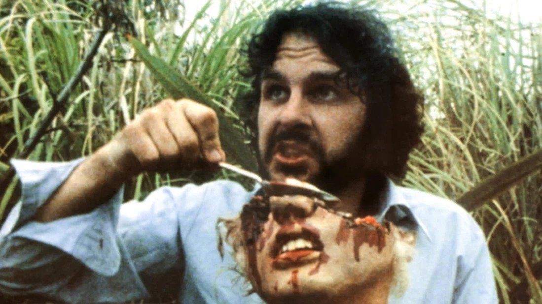
Peter Jackson was born in New Zealand on October 31, 1961. Since childhood, the future director loved photography, so he was given a beginner film camera, and that's how his love for cinema began.
Already in the '80s, he began making his first films, from which came his debut picture about an alien invasion, "Bad Taste" (1987). Jackson was not only the director, screenwriter, cameraman, and editor, but also played several roles, including one of the leads.
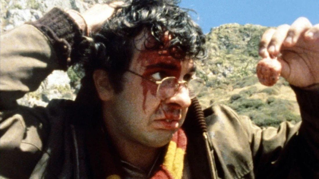
Most modern accounts of the director's early work begin with rhetorical platitudes: "Who would have believed that the creator of the low-budget film would later make a great saga?"
But in fact, such phrases are meaningless for several reasons at once. First of all, by the time he began his work on the Tolkien adaptation, the director had already released "Heavenly Creatures" (1994) with Kate Winslet and the witty horror film "The Frighteners" (1996). He had even been offered to direct a reboot of "Planet of the Apes" and "King Kong." That is, the studios at that point noticed the talent and potential of Jackson.
And secondly, if you look closely at his first films, you can see that the director, from the beginning, proved himself to be an excellent storyteller. Not only that, even in his early works, he has taken stories that partly resemble the idea of "The Lord of the Rings".
Does the analogy seem like a stretch? Not at all. Take his first feature film, "Bad Taste", a hint that the film parodies a bad movie while also referring to the story.
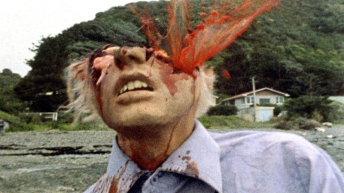
Although there was a problem with the plot in the first place, by design, this amateurish stunt was only 20 minutes long. Jackson did not have enough time or money for a full movie. He shot with an amateur camera and expired film. The work was done on weekends, and the director enlisted his friends to help.
Peter Jackson personally made sets and even cranes for the camera. Alien masks were baked in his parents' oven. But most importantly, the script was simply invented as the action progressed. Roughly speaking, in his spare time, a bunch of buddies would get together and fool around on camera. And so for four years in a row.
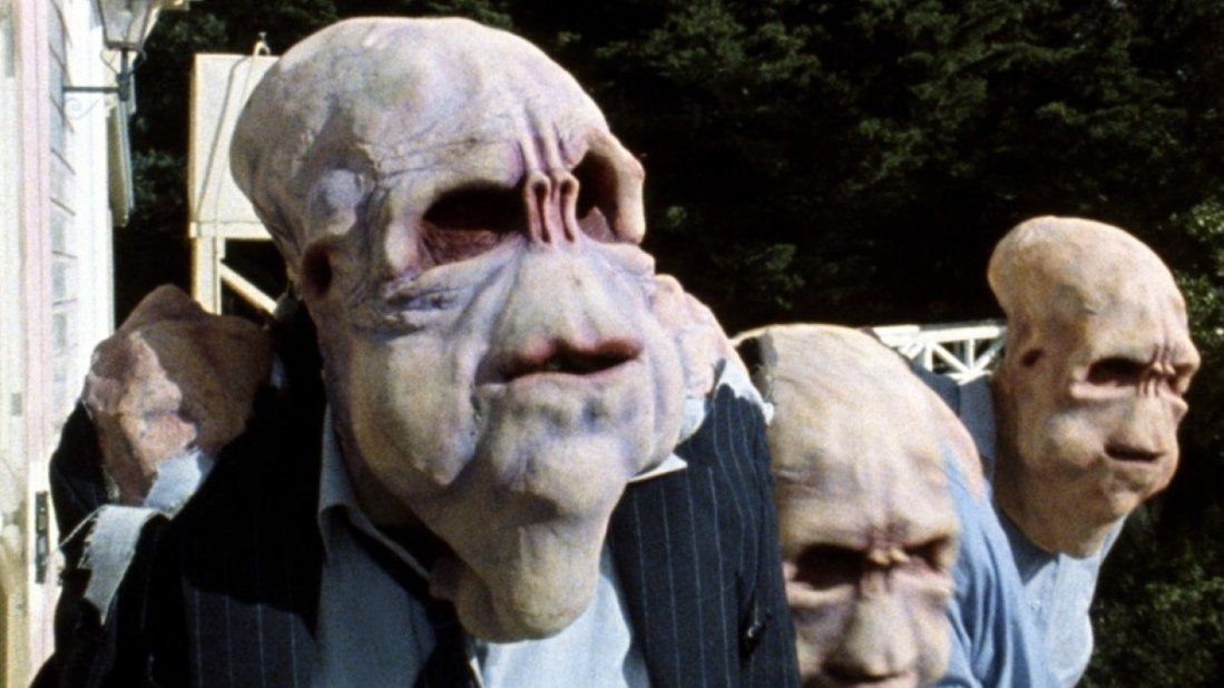
That's where the amazing thing begins: even with this approach, Jackson has a more coherent and logical film than many directors who take on invasion sci-fi. But what does "The Lord of the Rings" do with it? Well, let's compare.
The town of Kaihoro is attacked by evil aliens who masquerade as humans in blue shirts and jeans. The invaders devour the entire local population. Then the government sends a group of "The Boys" to care for the problem.
Wait a minute, this turns out that evil has come to a certain territory from another world. And to fight it, they throw not all available forces but a small team, where there are both tough guys and somewhat ridiculous characters. Doesn't it remind you of anything? "The Fellowship of the Ring" (2001), for example.
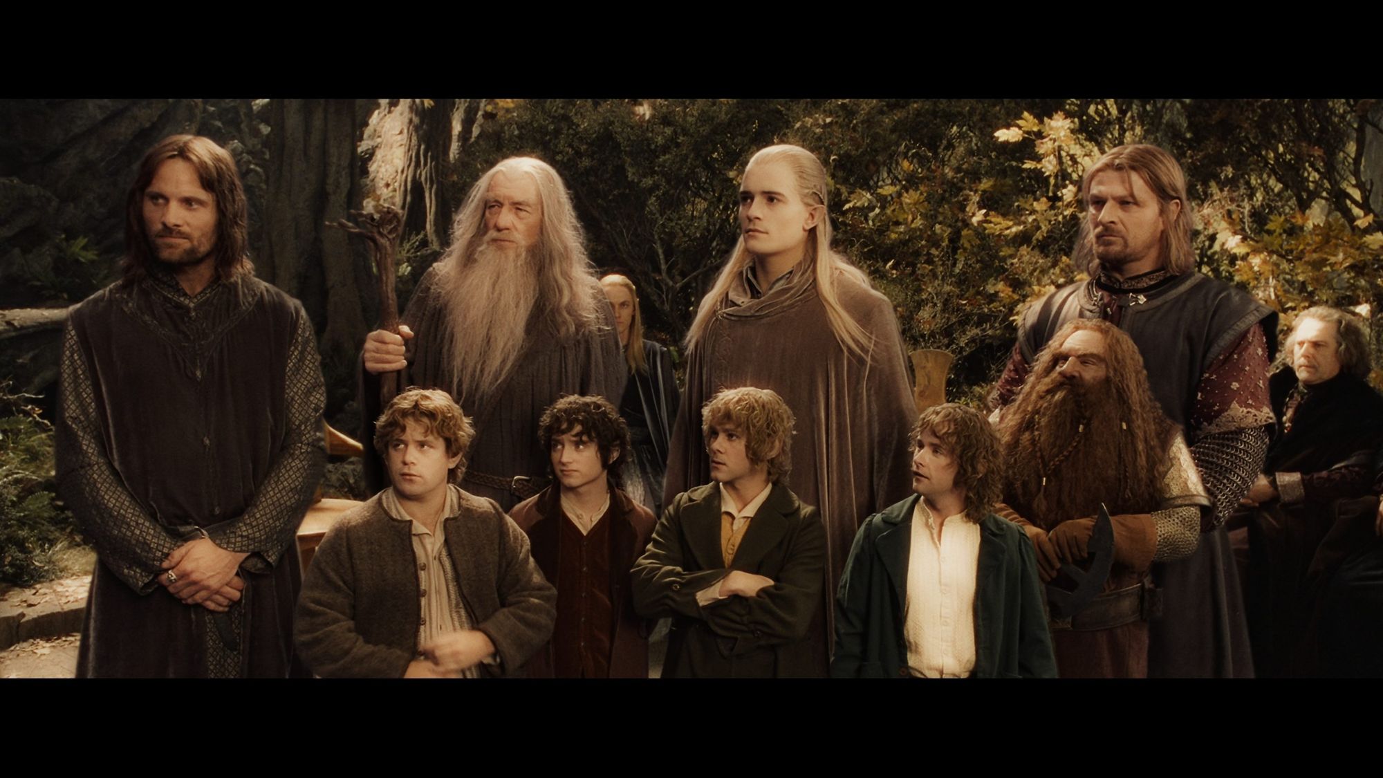
Of course, it's worth admitting that this is a typical adventure movie storyline that Peter Jackson will retell time and time again in his other works. In "Braindead" (1992), the kid fights zombies alone. In "The Frighteners" the hero and his friends face death itself. And then there's "The Lord of the Rings", where… well, you know. And each time, the followers of evil forces are as faceless as possible: people in blue shirts or orcs.
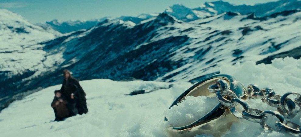
It goes on and on. While working on "Bad Taste, " the director learned to apply practical effects. And the lack of funds forced him to resort to ingenuity: half of the weapons used by the heroes were made of improvised materials. And now remember how in "The Lord of the Rings" they decided not to draw on the computer ring of omnipotence for close-ups but cast a huge copy.
But perhaps most importantly, in "Bad Taste," Jackson really showed a knack for creating great stories with textured characters. Yes, it's comedy and nonsense. But from the first film, Peter Jackson already proved that humor saves the day in any situation. Let's not forget that "The Lord of the Rings" has a lot of great jokes from hobbits, Gandalf, Gimli, and even Legolas.
"Bad Taste," of course, has a different level of jokes. There is also some good visual comedy with ironies over genre clichés and pop culture references. One character is even dressed as the fourth Doctor from "Doctor Who" (they joke about the aliens coming in a blue box, too), and by the end, a tough guy in a T-shirt will almost be killing aliens with his bare hands, like Rambo.
But all this is interspersed with a triumph of bad taste and grotesque. The project began as weekend entertainment and turned into something other than a feature-length debut. Even then, Jackson was picked up by the New Zealand Film Commission, adding about $200,000 to his paltry budget. And then "Bad Taste" hit the Cannes Film Festival, after which the picture was sold to various countries. This gave the first impetus to the professional career of the future creator of "The Lord of the Rings."
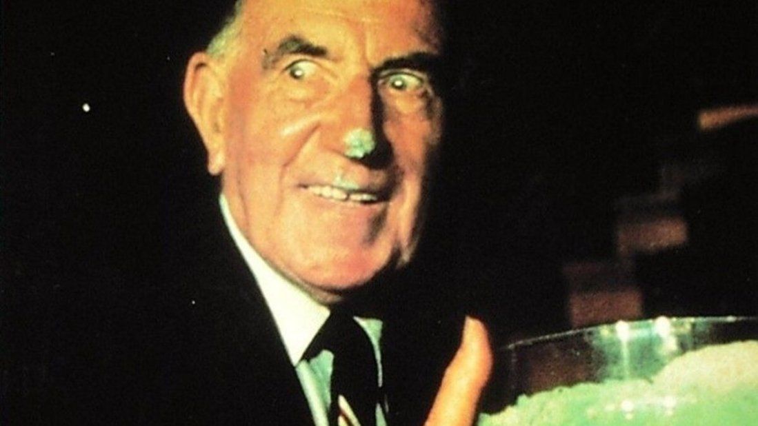
Of course, it's worth understanding beforehand: "Bad Taste" is not only an essential film for understanding the work of Peter Jackson, but also a challenge. Not all audiences will be able to endure the madness of certain scenes. Still, it's a fun and energetic movie that flies by in the same breath. Just be prepared for it to be weird, tough, and funny. And we don't recommend eating before watching.
How the great saga proved the virtuosity of the director's visual style
Why do we love "The Lord of the Rings" trilogy? For the incredible New Zealand landscapes that transport us to another world; for the revolutionary digital effects and perfect casting; for Howard Shore's stunning music, without which we cannot imagine Middle-earth; and for the wonderful choreography of the battle scenes. That said, "The Lord of the Rings" is not just a large-scale fantasy film but a truly good movie in which the choice of artistic devices is never random and always subordinate to the story's meaning. What visual storytelling techniques does director Peter Jackson use to tell us about Middle-earth, and how is the dichotomy of good and evil expressed in the trilogy?
Speaking of this franchise, it's hard not to immediately think of the stunning long shots, wide scenes, and static or helicopter shots of Middle-earth. Peter Jackson not only gives the viewer factual information about where the action takes place but also sets the scale of the story: we see an epic canvas with various characters, events, and locations. Occasionally, tiny figures of the characters appear against a backdrop of desolate landscapes. The scale contrast demonstrates the incredible hardships the heroes face and how small their strengths are compared to the severity of the journey.
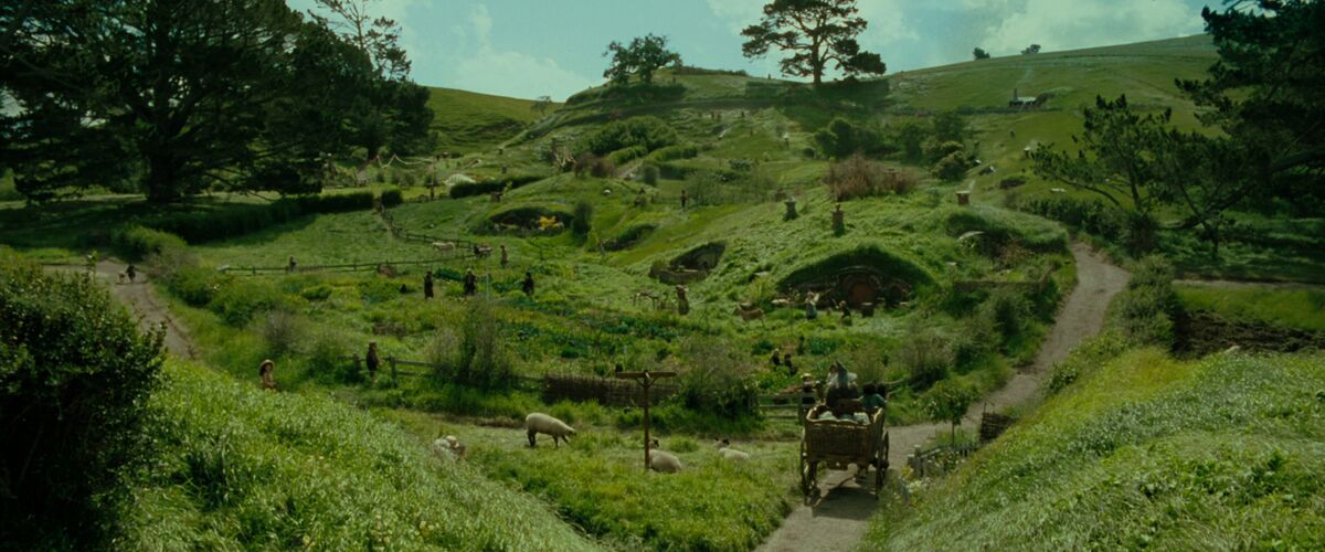
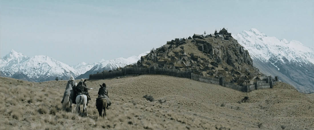
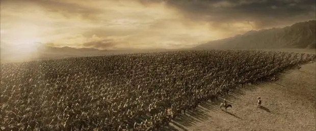
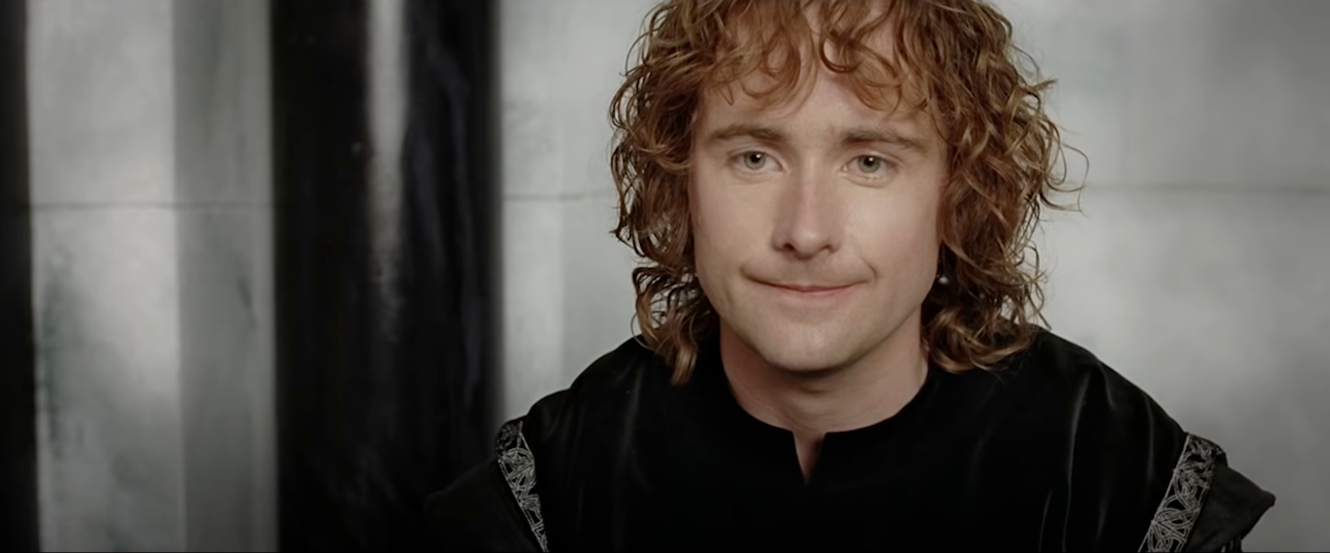
After all, we all know, if the long shots show us where the characters are and what is happening to them, the close-ups: show how they feel. Peter Jackson uses them very often in the timing of romantic scenes, battles, or even comic moments. It is not so much the striking special effects that are important to the director as allowing him to join in with the characters' emotions. The director especially often shows close-ups of the eyes because this is the closest approximation to the inner emotional world of the characters. And for example, such a trick allows us to consider the texture of surfaces, materials, dirt, and roughness, which makes the fictional world more tangible.
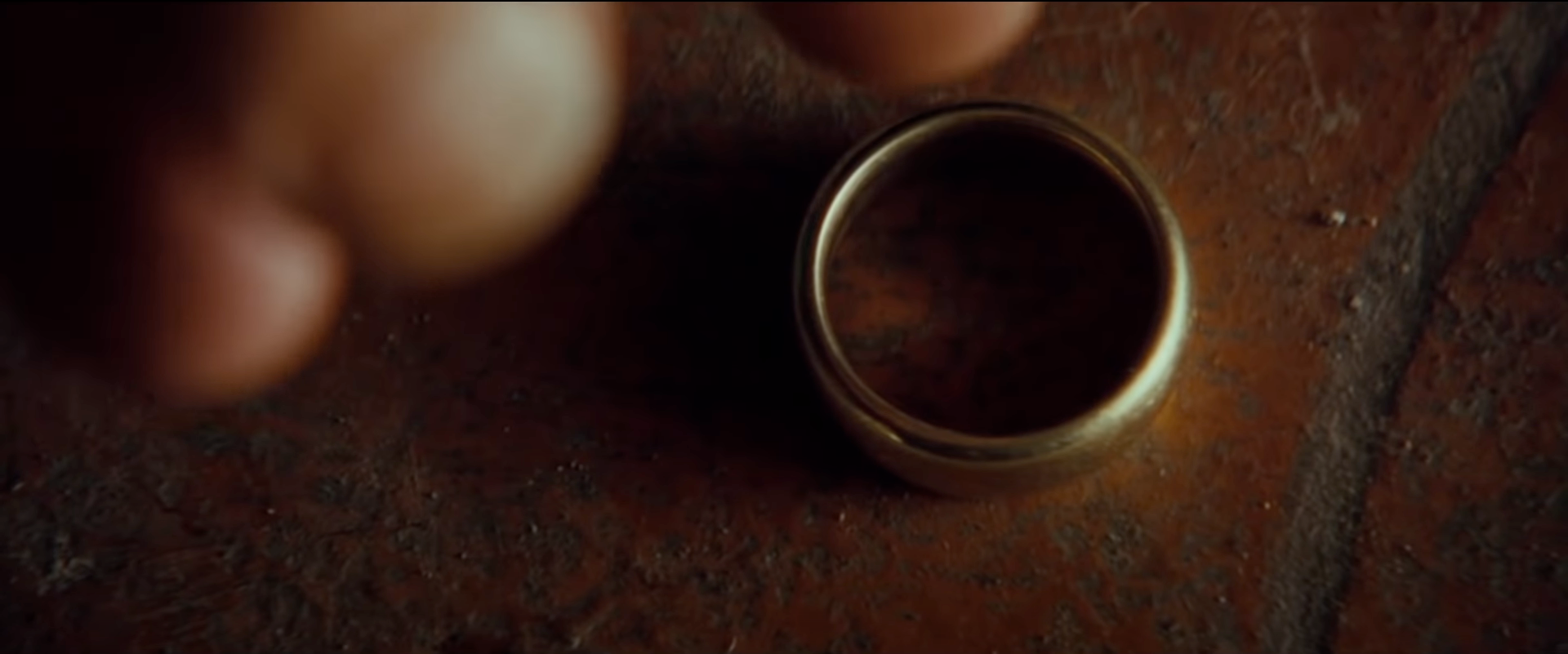
And the main object of the trilogy's material world, the Ruling Ring, is often shown in extreme close-up, making it stand out from the rest of the objects. This simple but ingenious move visually highlights and gives the ring the status of a separate character in the story. In fact, the entire essence of the trilogy could have been conveyed with just these two shots.
From the key moment of the story - the little Hobbit carrying the ring to Mordor - Peter Jackson chooses the contrast of close-ups as a systematic device for the entire trilogy. For example, a close-up of Gandalf standing on a balcony, calmly smoking a pipe. The next shot is a frightening long shot: the darkness of Mordor has covered everything around him.
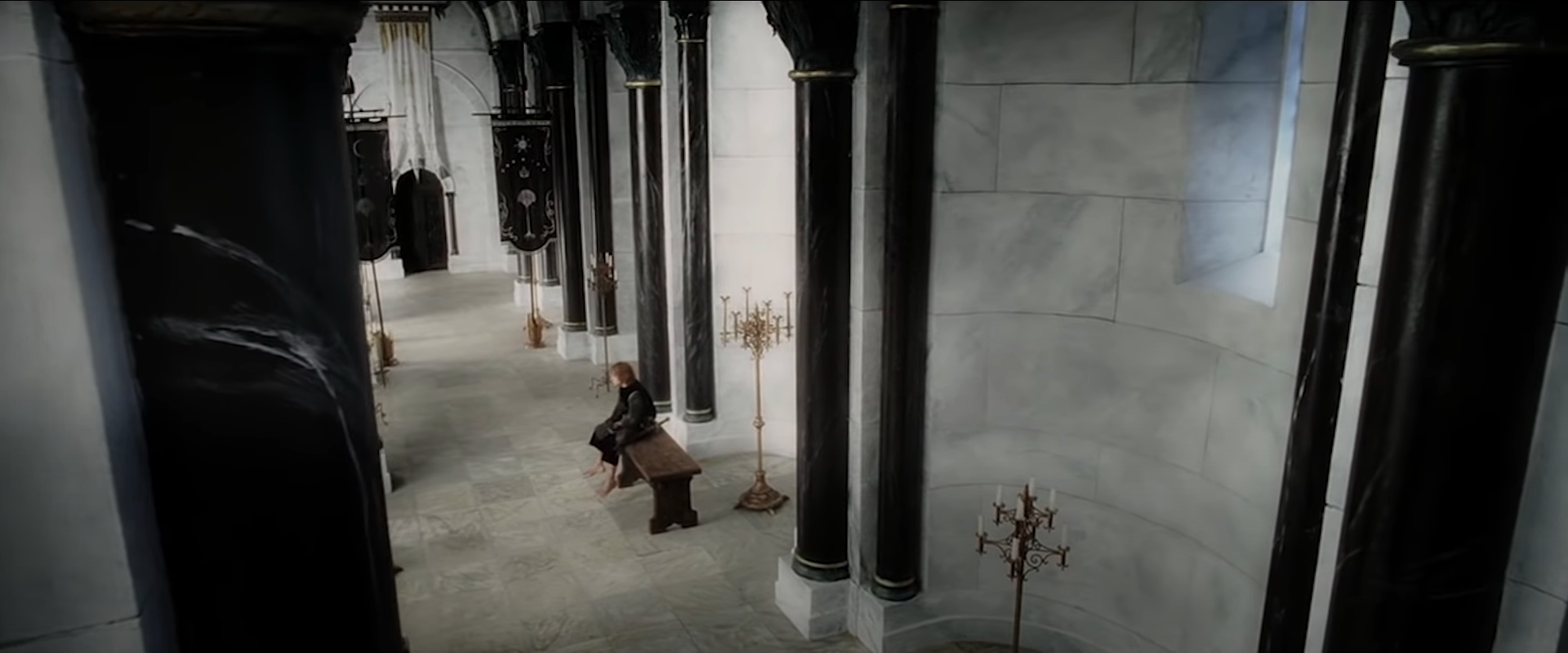
Or the vast throne room, where the perspective from above reinforces the long shot. In such visual circumstances, we understand that the little Hobbit is experiencing his worthlessness. This abrupt transition allows us to express the alienation between the characters and their surroundings and displays the scale of the challenge that the world poses to the characters.
Next is the camera angle. We have already said that the Ruling Ring, as the physical embodiment of the power of darkness, becomes a separate hero of the narrative: it gets not only extra close-ups but also its own point of view. For example, not only does Gandalf look at the ring, but the ring looks at him.
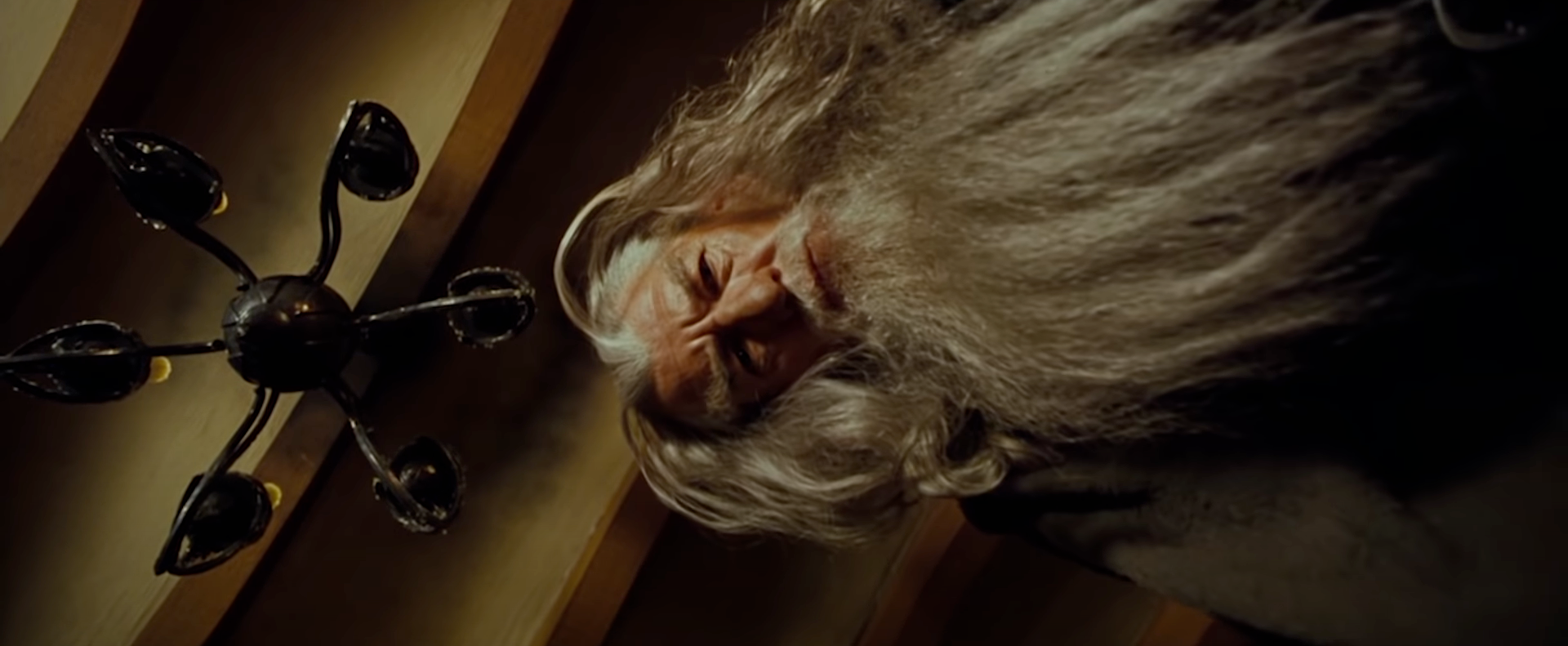
Note the tilted camera angle that conveys the ring's gaze as the dark lord. The camera tilts back and forth relative to the horizon, and when the viewer is presented with a ball through which Sauron can watch others and sneak his head in. And when Frodo experiences an altered mental state under the ring's influence, the camera also tilts. This technique is called the Dutch angle and expresses madness and disorientation. This is how the world appears to the dark lord.
How else can the dichotomy of good and evil be expressed through perspective? When the objects are shot from below, they look menacing, and even the peace-loving Hobbit Bilbo looks mad when he falls under the spell of the ring of omnipotence.
The perspective from above makes the characters visually smaller and more defenseless. Look at Saruman's last conversation: although he is almost defeated, he does not leave the pinnacle of his arrogance, and his contempt for all living things remains unchanged. The entire conversation between the heroes standing on the ground and Saruman responding from the top of the tower is a succession of upper and lower angles. However, as soon as Saruman is killed, the perspective immediately changes, and we see him, defeated, falling.
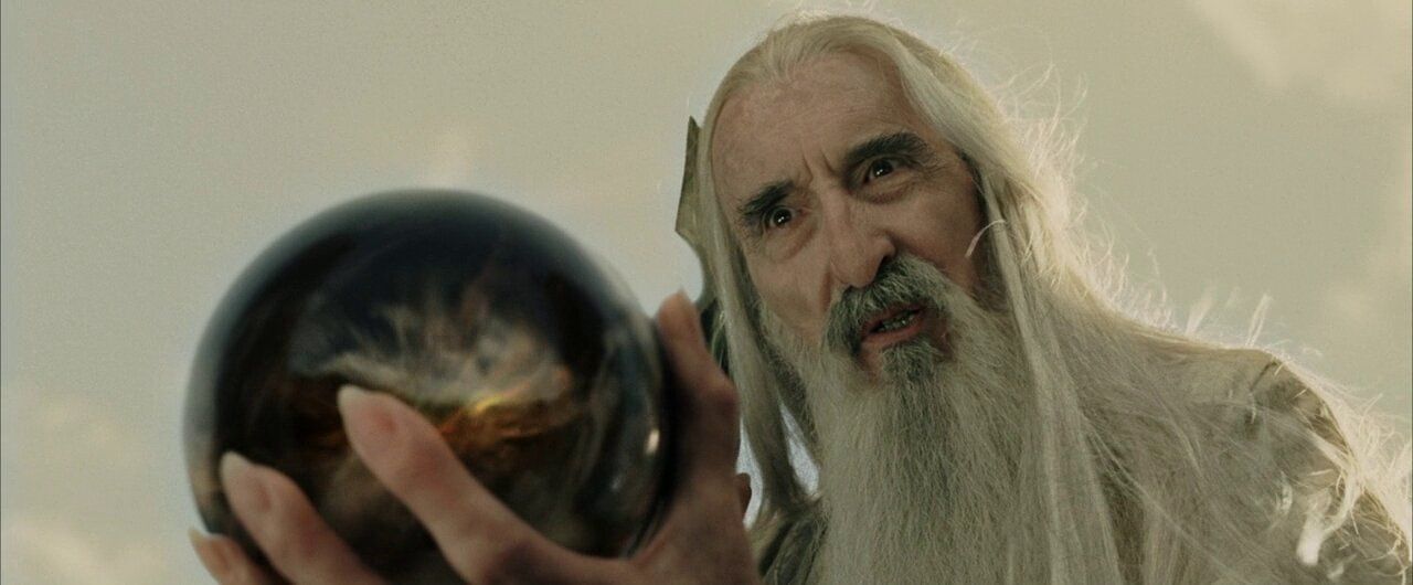
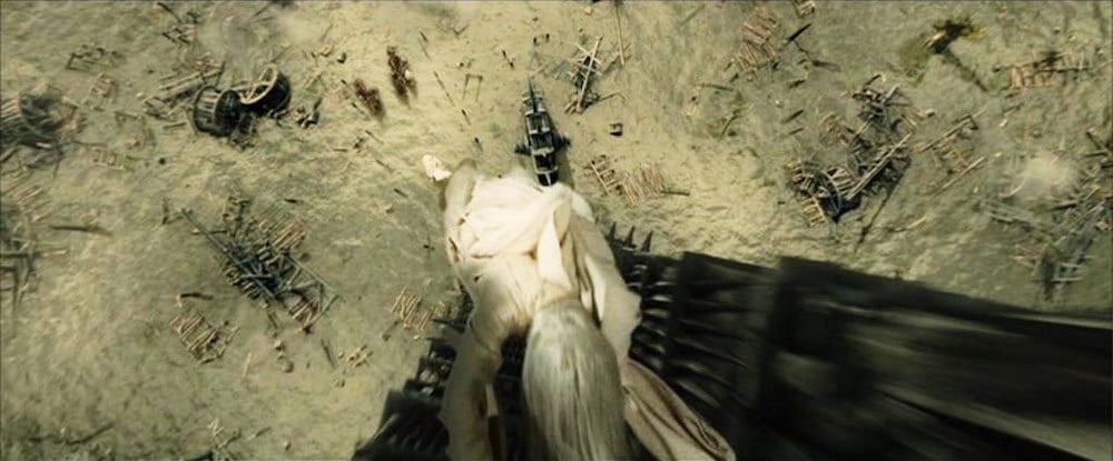
The change in the upper and lower perspectives is the drama of the events of the trilogy, most of which are battles. The struggles the characters wage involve shifting positions of power. Here, for example, are the shots leading up to the final battle: the characters shown from an upper perspective, they seem small and insignificant. In turn, the enemy gates, depicted from a lower perspective, on the contrary, seem intimidating and imposing.
But already after the destruction of the ring, the perspective changes, which is accentuated by the movement of the camera: now we are looking at the dark forces from above, and the higher the camera, the less threatening it looks. Peter Jackson uses upper and lower angles to express that evil tends to occupy power and build hierarchy and dominance. The changing angles symbolize the fact that power cannot last forever - sooner or later, evil will fall.
The color filters that Peter Jackson makes extensive use of in his films also tell much of the nature of good and evil. Good marks are light, warm hues, and evil ones are dark, cold hues. The rich colors of the hobbits' homeland, the Shire, are replaced by increasingly pale and lifeless landscapes.
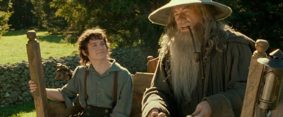
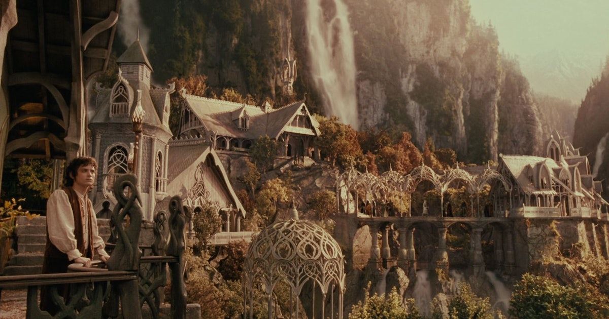
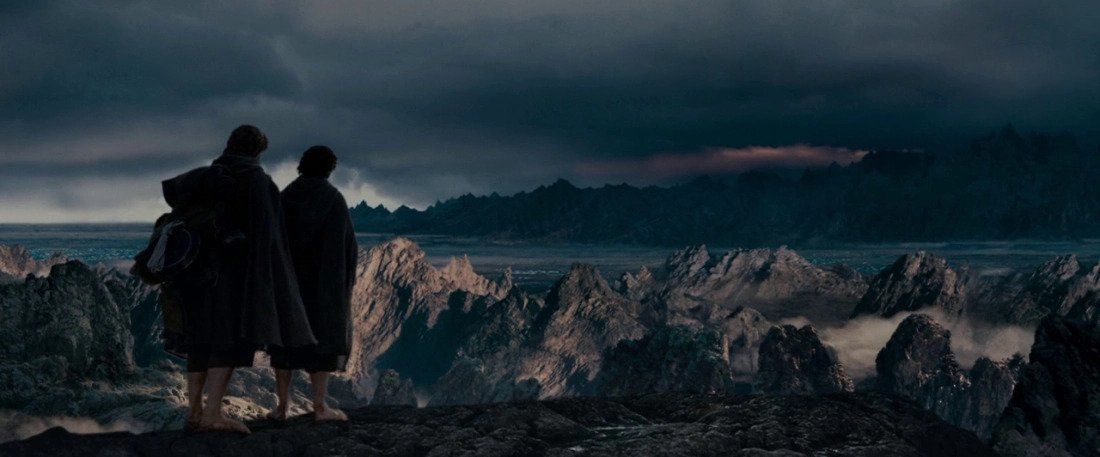
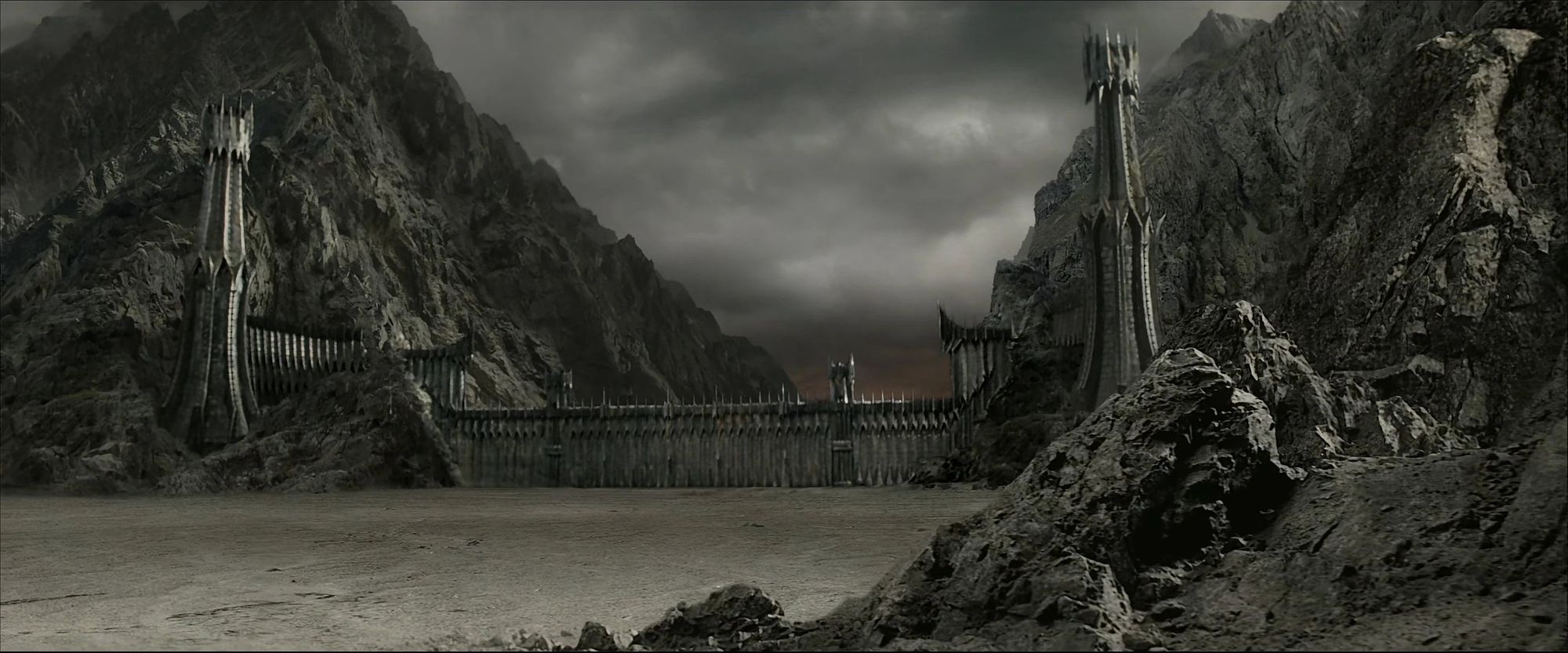
It's simple: black is death, and white is life, resurrection, and rebirth. Intriguingly, black and white are reversed for those who fall under the influence of the ring, just like in the negatives, resulting in extremely frightening images.
Camera tilts distort the world under Sauron's gaze, and now we see that for his followers, the color is reversed as well.
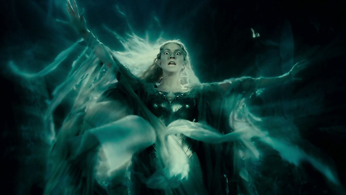
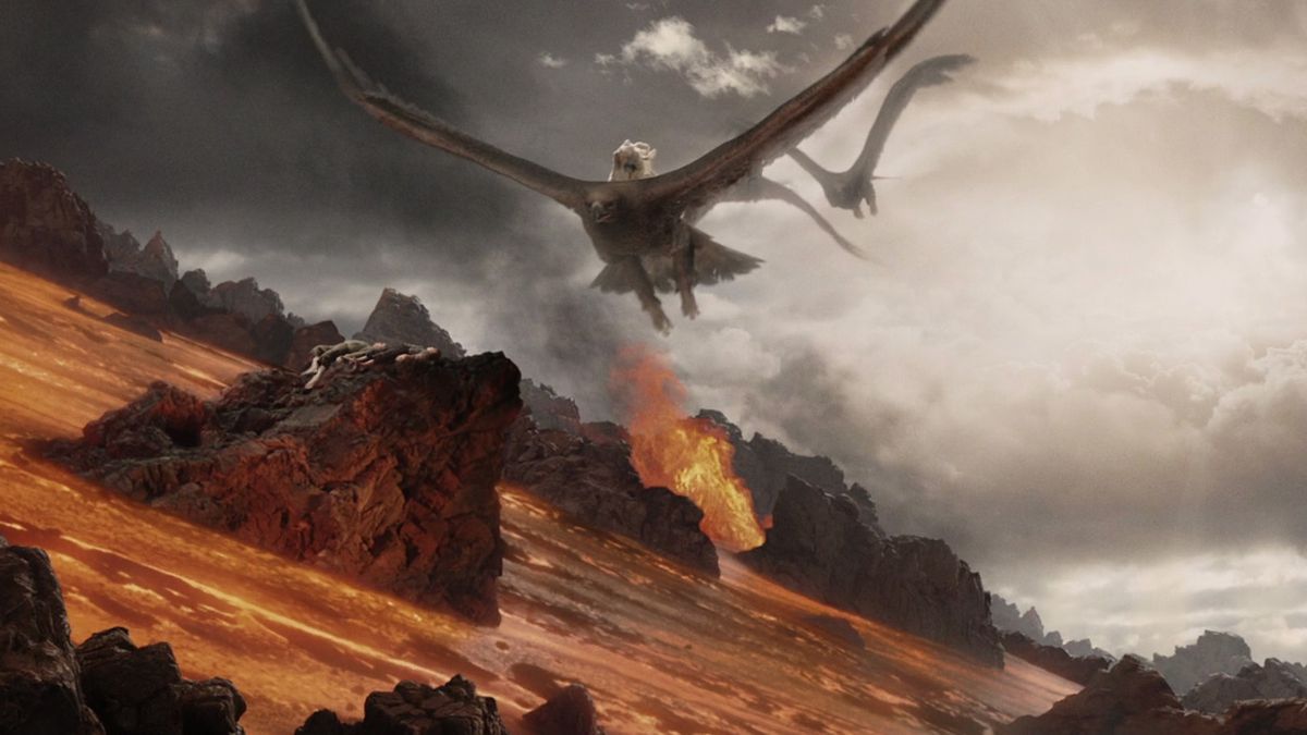
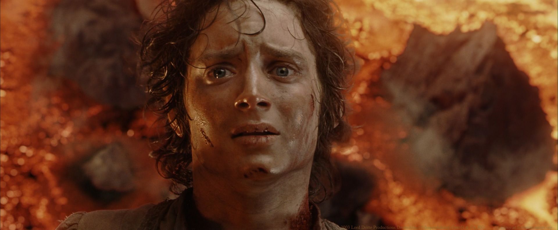
Peter Jackson's mastery of color dramaturgy is confirmed by the climactic scene in "The Lord of the Rings: The Return of the King" (2003). The closer Frodo gets to the fateful mountain, the more reddish-orange the image becomes: the protagonist finds himself in the heart of darkness at the edge of an abyss full of hellfire.
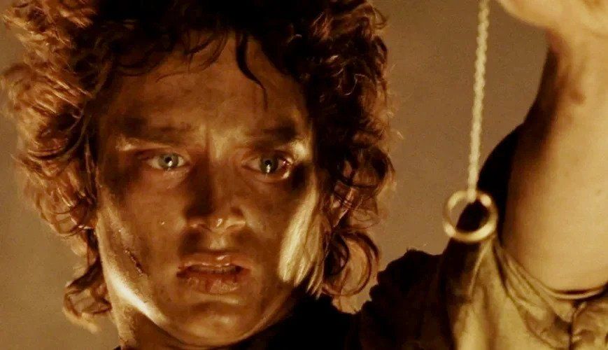
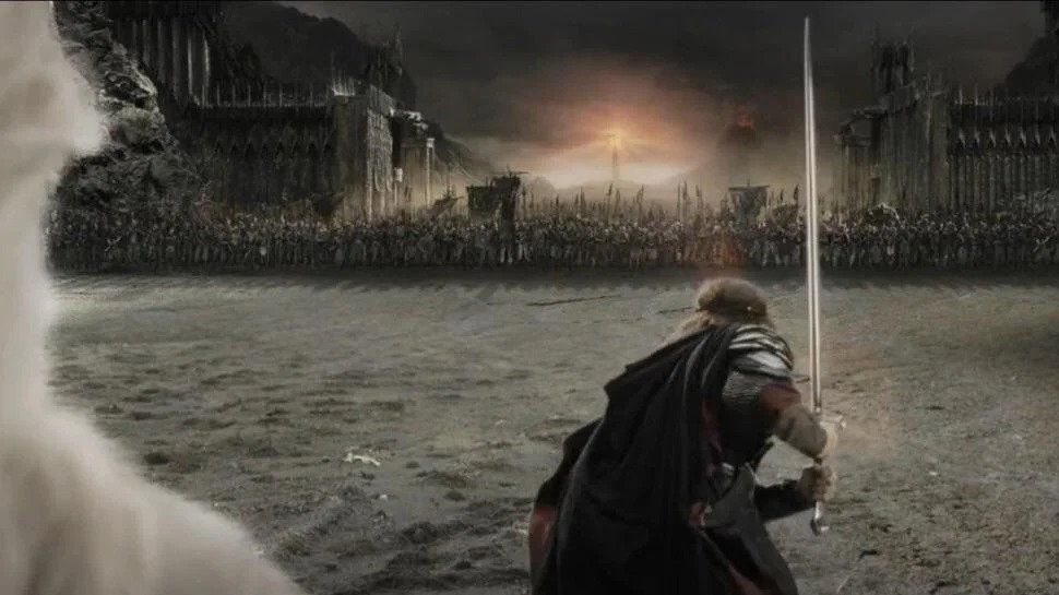
Meanwhile, parallel to the fiery prices, we are presented with the battle between Aragorn's army and the horde of orcs in white, gray-blue shades. Thus, the final battle with evil takes over the entire world underground and in the sky. When both battles end, the two colors and storylines come together in the same frame.
Afterword
The universal story and visual style of "The Lord of the Rings" won't get old in years to come. With such a fine sense of dramaturgy, Peter Jackson has managed to create iconic films in which you can find new meanings and discover something important about themselves every time. This director sees the visual language of cinema not just as an opportunity to fill a picture with aesthetics but as a chance to tell stories first and foremost. In The Lord of the Rings trilogy, he proved to the world that cinema is a visual art.
From Breakdown to Budget in Clicks
Save time, cut costs, and let Filmustage's AI handle the heavy lifting - all in a single day.